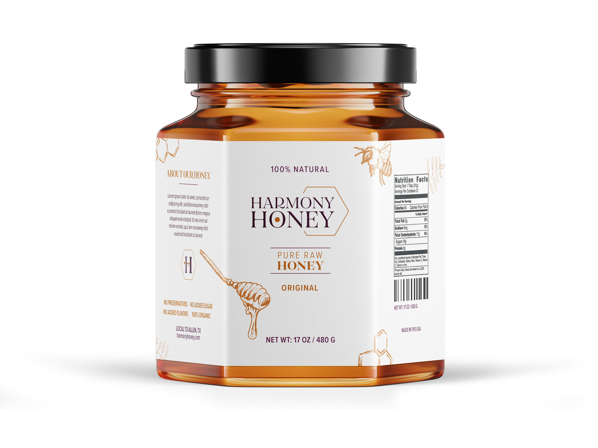
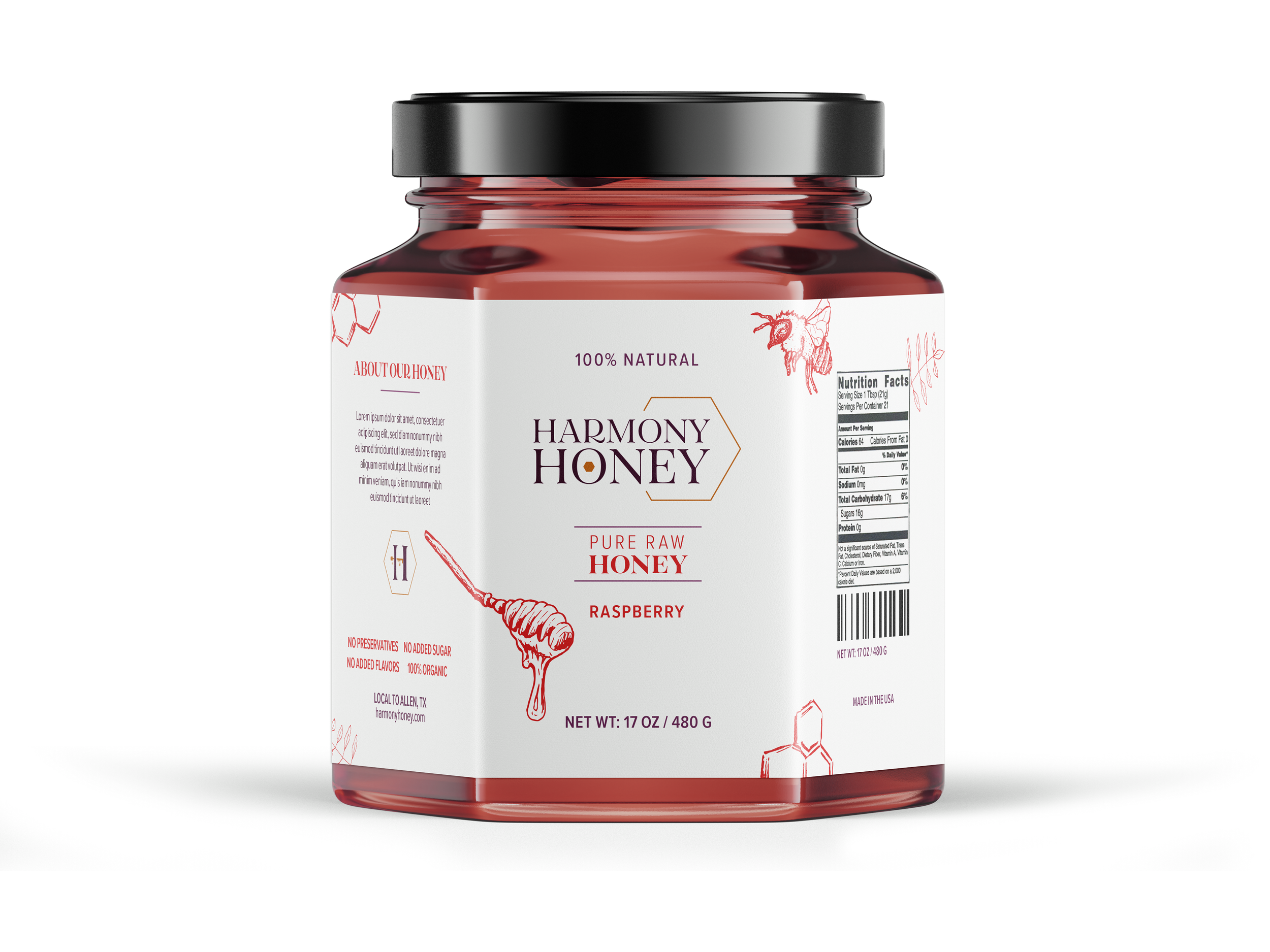
Harmony Honey
Project: Logo Design
Year: 2021
Notes: Collin College – Class Assignment
This was a logo design assignment in my Typography class at Collin College. The primary goal of this assignment was to explore typographic options for logos and to experiment with monograms as a form of logo. Initially, this design was very stiff and had the expected colors of gold and brown for a honey brand. I updated it with a softer typographic choice while still keeping the same concept. I also expanded the color palette to have a broader range of hues and developed package designs as well as digital assets.